What Makes a Good Logo?
Filed in Advice for Clients
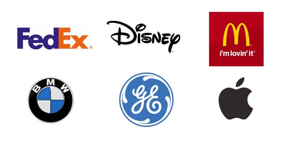
Look at these icons below- arguably the most recognisable logos on the planet. Do you know who they belong to? Of course you do.
You could probably also tell me what products/services they sell, what sorts of people buy from them, what values they stand for, perhaps whether or not you would buy from them… all from just a single glance.
Here are a few tips on how to make your own logo design effective as a shorthand for your client’s whole company identity.
Keep it simple
With so many logos permeating our popular culture, the need for yours to stand out can make all those colour gradients and Photoshop paintbrush effects seem like a great idea. In reality, it’ll look unfocused and messy, and the company will seem amateurish as a result.
Look at most successful company logos and you’ll see simple geometric shapes and sparing use of colour. These logos are recognisable & memorable because they’re so straightforward.
Don’t be tempted to just copy your favourite brands, though – your logo should be unique to your company, not only in how it looks, but what it stands for.
Be smart with colour
An awareness of the psychological & cultural associations of different colours can help you convey your corporate identity more effectively when designing your logo.
That might all sound like marketing speak, but consider this – is bright orange appropriate for a funeral director’s? Would dark green & brown look right for a sexy young PR firm?
Research different colours and their symbolism, not only within popular culture but within different industries and worldwide culture – especially if the company is selling to an international market.
Don’t be too literal
A great logo instantly tells people what the company in question can do for them – but relying on an icon of the product isn’t an ideal solution.
You can use product imagery as inspiration, but being directly literal often looks tacky and leaves you little wiggle-room if the nature of the business changes down the line. Being more subtle and clever with your design can yield a more interesting, eye-catching logo.

Plan, plan, plan
Even the most famous logo designs are the result of incremental changes over several years – but redoing your logo again and again isn’t helpful. Customers will fail to recognise the new logo belongs to the same company. It also implies the company doesn’t really know who it is or what it stands for – and who wants to do business with a company like that?
Getting it right first time means planning your design thoroughly. Create different designs. Create variations on designs. See how they fit with the company’s existing design style. Test different colours and orientations. Test how they look in print, on the net, on videos, on product packaging etc. This might all seem like a faff, but it could save you some major headaches down the line.
Logo Design Services
If you’re in need of a top notch logo, give me a call or drop me a quick message, I offer several fixed price logo design packages with unlimited revisions.
You could also try your hand at creating your own logo, it’s great fun and even if it’s not completely polished, it’ll be a great help should you choose to hire a professional, as it’ll help them understand what you’re trying to achieve with your new logo.
Check out some of my logos below:
Based in London, Working Everywhere
I’m a Freelance Web Designer and WordPress developer, I’m based in London but work with client’s in the UK and all over the world.


